Back to Projects
Print Design
Lookalike Magazine Project
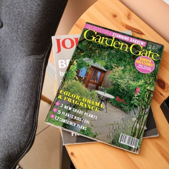
This fun lookalike project was one of the first print and image design I accomplished during my time at MiraCosta College. I was tasked with creating a near-perfect look alike magazine cover for a publication I enjoyed. I selected "Garden Gate", a magazine focused on backyard garden hobbyists.

My Process and Insights
-
#1: The pen tool is not as terrifying as it looks. To copy the title font as near-perfect as possible, I painstakingly outlined the title logo.
-
#2: The original magazine cover used 3 font types within their design. I minimized font-confusion to create a cleaner look so readers could skim the cover and get all the information they needed.
-
#3: I became aware of what other publications use to grab readers' attention. I began to observe and question: Where do I look first? Second? And why? Is this what the publication intended? It made me a more discerning reader and designer.
Why This Project Matters to Me
I carry this observational design discernment with me today. Even though this project seems deceptively simple, it really was a challenge to get the balance of title, subheaders, and image just right.
